From Homesandgardens · · 1m 40s
Sherwin-Williams' Modern Heritage, decoded
A five-shade palette that puts historic pigment depth into rooms that still feel current.
In brief
A five-shade palette that puts historic pigment depth into rooms that still feel current. Let warm neutrals carry the room and save the saturated shades for millwork, paneling, and cabinetry. Originally reported by Homesandgardens.
Old house, new mood
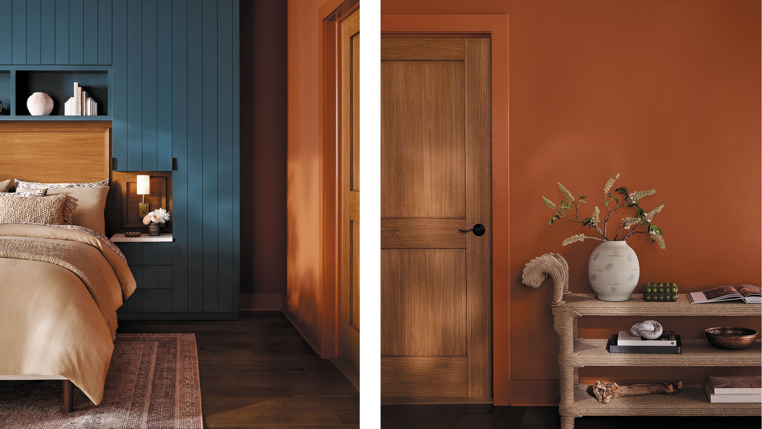
Sherwin-Williams built the Modern Heritage palette to bridge traditional architecture and contemporary rooms, so a period house can feel current and a new build can feel settled.
“Rather than recreating the past, Modern Heritage evolves it.”
Minimalism is losing ground
Color Marketing Manager Emily Kantz ties the palette to people wanting homes that feel layered and personal instead of perfectly pared back.
“a renewed appreciation for spaces that feel layered, personal, and rich with meaning”
Historic pigments, turned up
The colors come from pigments in old houses, classic textiles, and worn materials, then get remixed with more saturation: rich blue, earthy green, warm neutrals.
“These colors feel rooted in history, yet contemporary in their application.”
The five shades
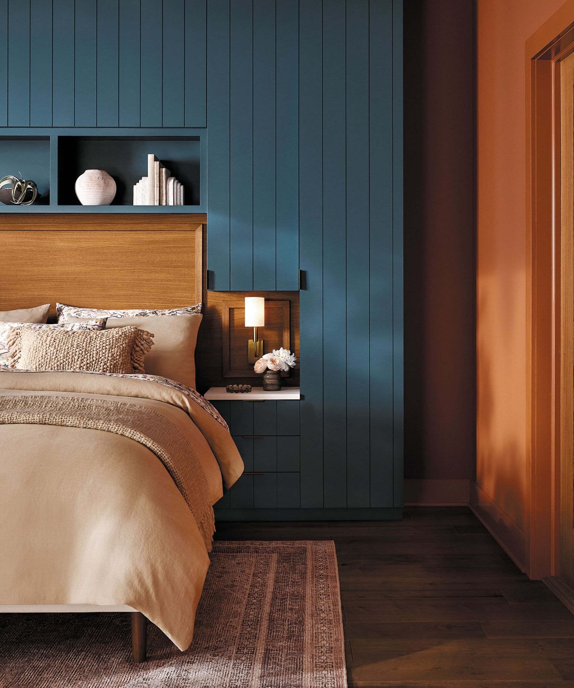
Mortar is a warm off-white, Rose Tan a muted pink with orange under it, Bunglehouse Blue a gray-softened mid-blue, Pennywise a burnt orange, Nocturne a complex charcoal.
Bold on the bones
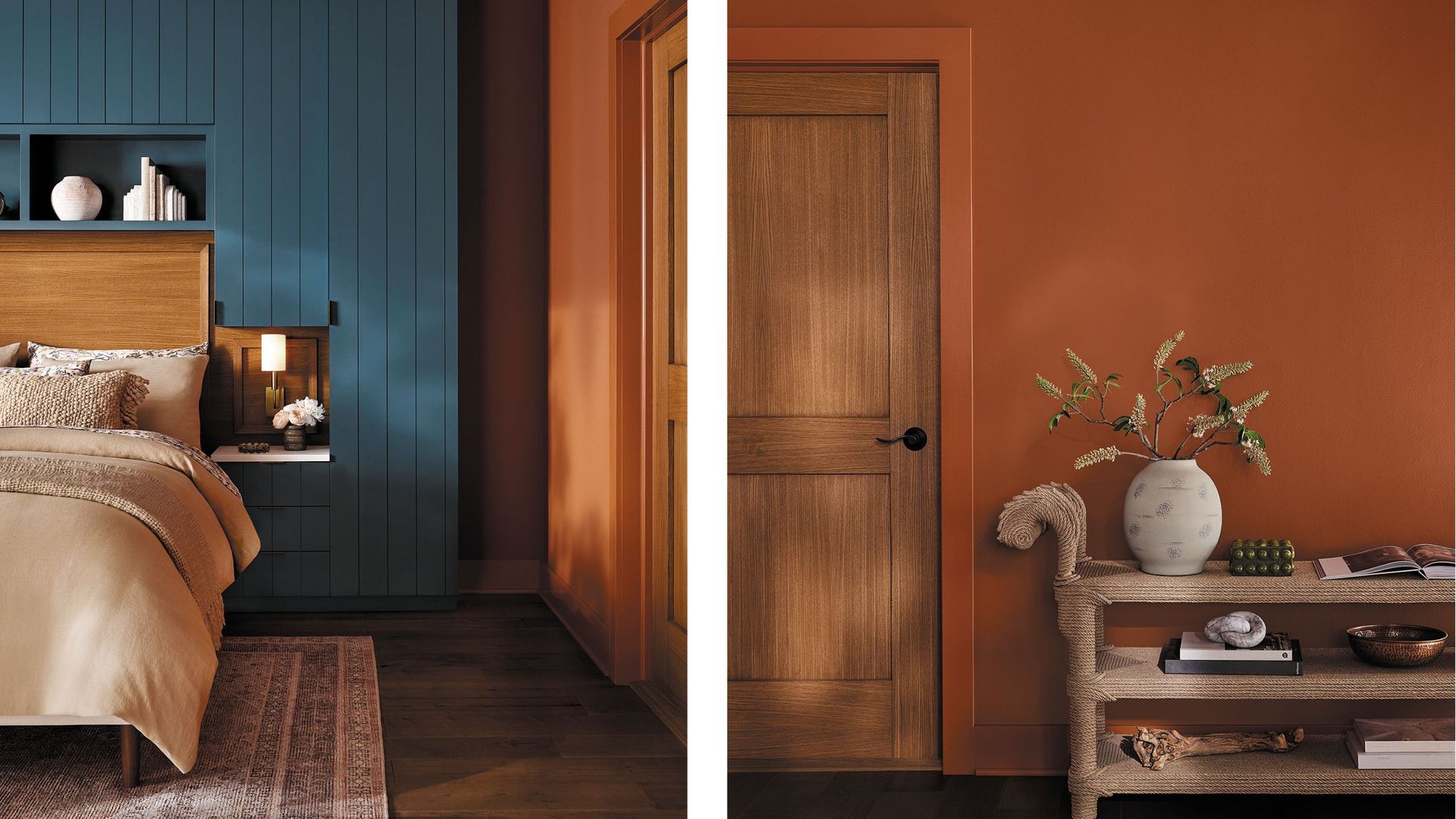
Use Pennywise, Nocturne, or Bunglehouse Blue on millwork, paneling, built-ins, and cabinetry. Warm neutrals do the heavy lifting everywhere else.
“Use these shades to highlight architectural details like millwork, paneling, built-ins, and cabinetry”
Materials that carry it
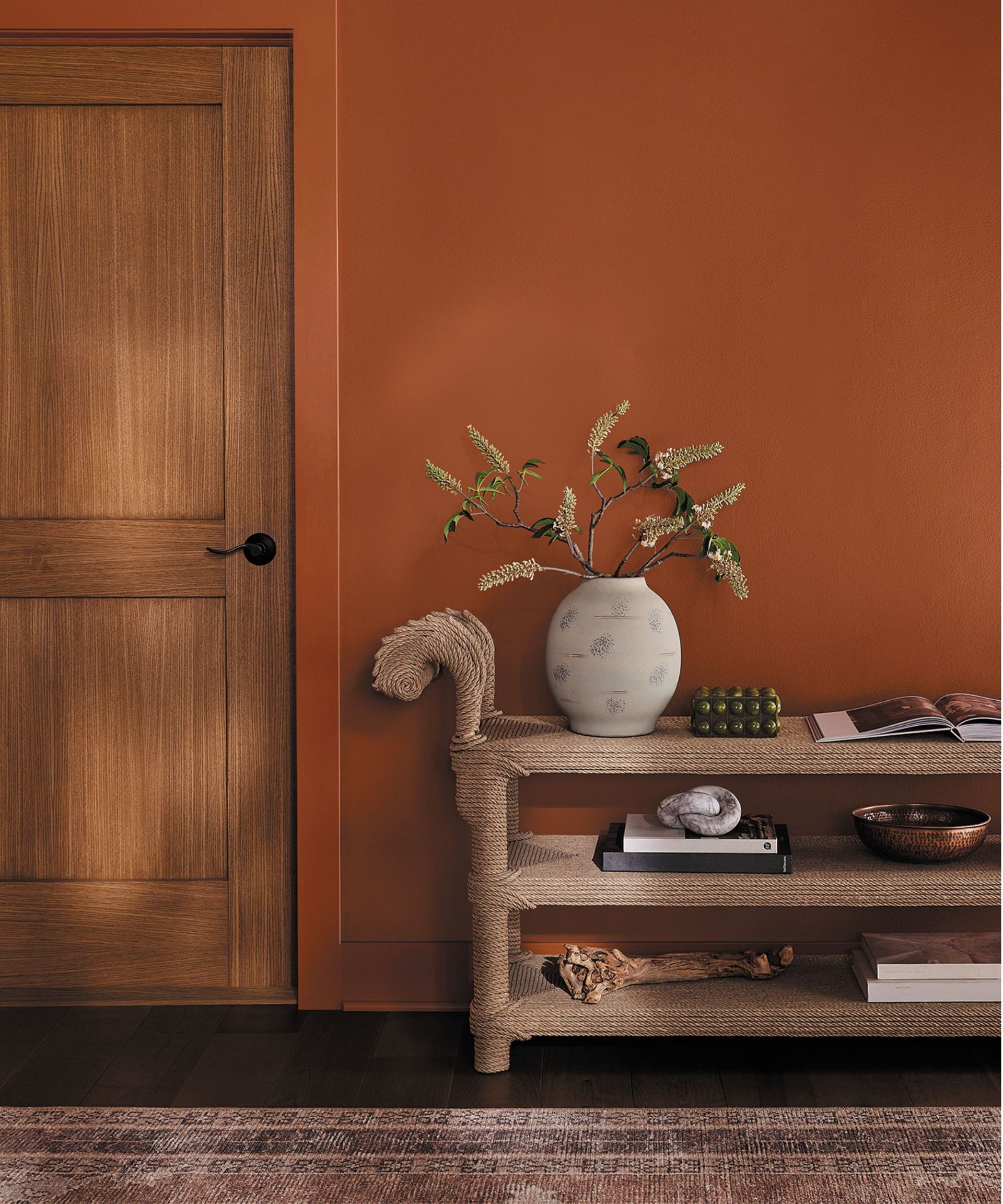
Walnut, oak, and chestnut with visible grain, aged brass and antique bronze, natural stone, plus wool, leather, and handmade ceramics for a lived-in finish.
“Textural elements like wool, leather, and handcrafted ceramics bring warmth and a lived-in quality”
Character over perfection
Ornamental moldings, vintage furniture, and handcrafted pieces meet confident color. The room should read as collected, not staged.
“expressive, collected, and highly individual”
You can start small
No need to scrap your current scheme. Pick supporting shades from the same families, warm neutrals, earthy browns, muted greens, deep blues, and let the saturated colors do the talking.
The main idea
Let warm neutrals carry the room and save the saturated shades for millwork, paneling, and cabinetry.