From Loudwire · · 1m 10s
Why Type O Negative Used Neon Green
Type O Negative's guitarist explains why neon green dominated their logos and imagery.
In brief
Type O Negative's guitarist explains why neon green dominated their logos and imagery. Type O Negative's guitarist Kenny Hickey revealed Peter Steele chose neon green to stand out in the New York rock scene. Originally reported by Loudwire.
Peter Steele Wanted Band to Stand Out
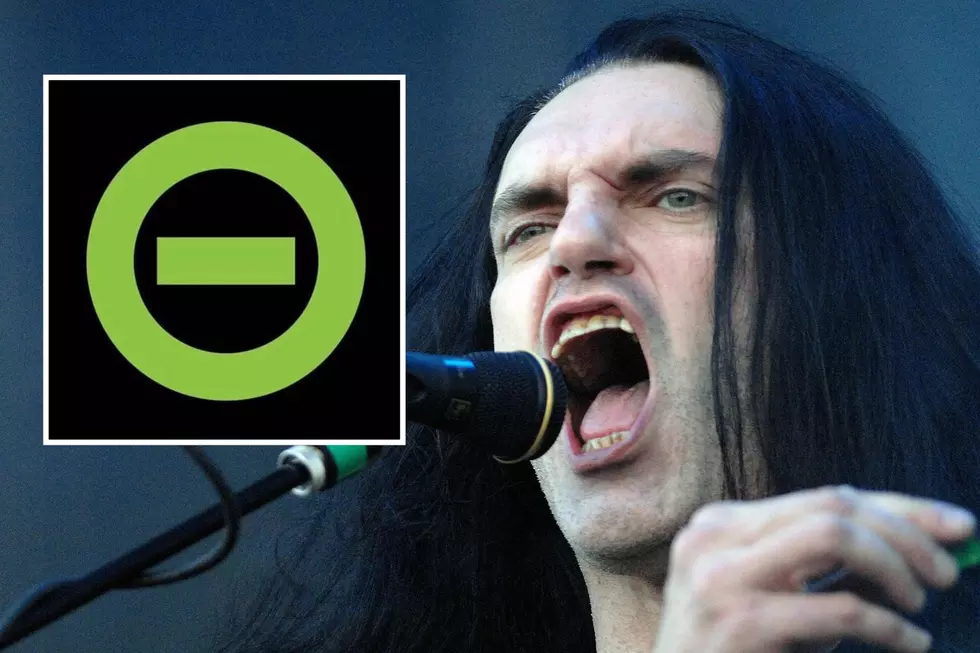
Type O Negative guitarist Kenny Hickey explained Peter Steele insisted his band stand out in New York's rock scene.
“He (Peter Steele) hated the whole generation where guys went on stage wearing other rock band shirts”
Steele's Repulsion to Common Rock Imagery

Peter Steele rejected rock bands wearing other band shirts, demanding musicians have unique identifying symbols.
“That's bullshit. You're a musician. You should have an image. There should be something identifying you and separating you”
Neon Green Was Steele's Choice
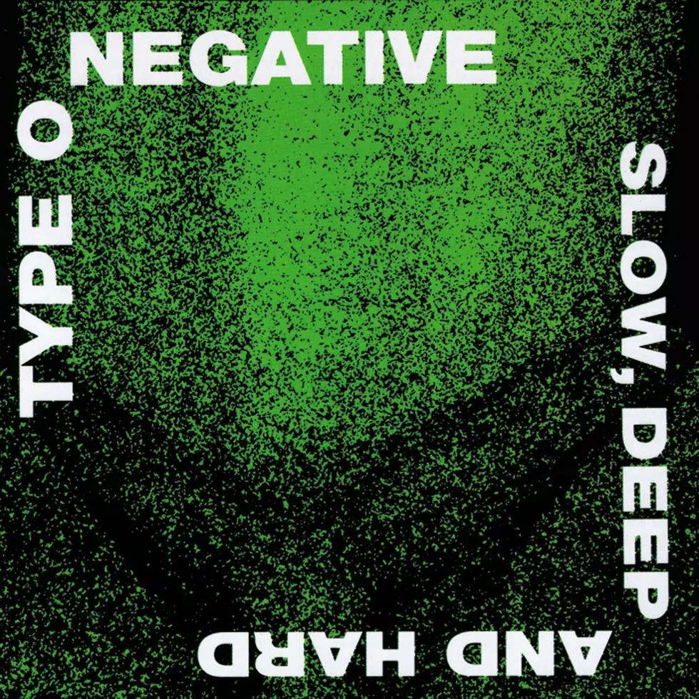
Kenny Hickey credited Peter Steele for suggesting neon green as the band's primary color scheme.
“He felt green was the most repulsive color”
Green Paint Job Failed
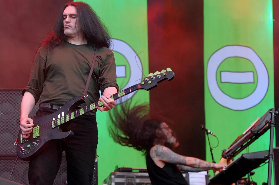
Peter Steele used cheap green paint from his NYC parks job, but it never dried due to humidity.
“It was so humid down there and he painted the walls green and it never dried”
Band Symbol Came First

Type O Negative's logo of an O with a negative sign started at a Brooklyn club called Negative Night.
“Peter was the one who was kind of behind it, putting it together, and he called it Negative Night”
Name Changes to Type O Negative
The band changed names from New Minority to Repulsion to Sub-Zero before settling on Type O Negative.
“We picked Sub-Zero to fit the symbol and then we found out we got threatened that we're going to get sued”
The one thing
Type O Negative's guitarist Kenny Hickey revealed Peter Steele chose neon green to stand out in the New York rock scene.