From TradingView · · 1m 30s
Yields vs dollar: one chart for the week of Sept 14
A weekly US 10Y read shared as a live chart layout, where the marked levels do all the talking.
In brief
A weekly US 10Y read shared as a live chart layout, where the marked levels do all the talking. Grabbing the chart only opens a copy. Use Save As to name it as your own layout, or it vanishes when you close the tab. Originally reported by TradingView.
A week framed in one chart
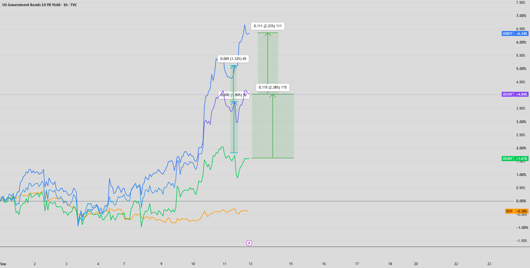
ryani8877 posted a US 10-year yield idea for the week of September 14, set against the dollar. The argument is the chart itself rather than a written thesis.
Levels do the talking
The post points readers to the levels and key areas drawn on the chart. Nothing is spelled out in prose, so those marked zones carry the whole call.
“See levels and key areas for this week”
How to open it live
Follow the link, then click Grab this Chart at the bottom right, or Load Live Bars on the far middle right. Either one drops you into the author's chart environment with live data.
Grabbing is not saving
The copy you open is temporary. It does not land in your dashboard on its own, which is the step most people miss.
““Grab this Chart” opens a copy of the chart environment, but it doesn't automatically save as a permanent layout in your dashboard.”
Save as your own layout
Click the cloud or save icon at the top of TradingView, pick Save As, and name the layout. After that it appears in your saved layouts and dashboard going forward.
It is not advice
TradingView attaches a standing disclaimer to published ideas. The chart is one trader's read for the week, not a recommendation the platform stands behind.
“not meant to be, and do not constitute, financial, investment, trading, or other types of advice”
What it means
Grabbing the chart only opens a copy. Use Save As to name it as your own layout, or it vanishes when you close the tab.